
Table of Contents
- Understanding Textured Coastal Wall Art
- Step 1: Define Your Coastal Colour Palette
- Step 2: Assess Texture and Material in Person or From Photos
- Step 3: Choose Artwork Size and Scale for Your Wall
- Step 4: Match Artwork to Coastal Interior Design Trends
- Step 5: Select Between Canvas, Prints, and Framed Art
- Step 6: Styling Textured Canvas Art in Your Room
- Creating a Focal Point and Balancing Your Decor
- Frequently Asked Questions
Last Updated: October 9, 2026
Understanding Textured Coastal Wall Art
Choosing textured coastal wall art requires more than picking a pretty picture. The tactile finish, material quality, and how light plays across the surface matter as much as the imagery.
Textured finishes add depth flat prints cannot match: light hitting real brushstroke texture creates shadow and movement, the difference between art that feels alive and art that feels flat.
The challenge is knowing what to look for. You can't feel texture through a screen, and you may worry a reproduction won't capture the original's depth. Hence this step-by-step guide.
Step 1: Define Your Coastal Colour Palette
Ocean blues, sandy neutrals and seafoam greens are fine advice but not a method.
Work to a 60-30-10 split. One dominant tone for roughly 60 per cent of the surface, a secondary tone for about 30 per cent, one accent for the remaining 10.
Anchor the dominant tone to your fixed finishes. List the colours you cannot change: floorboards, wall paint, cabinetry, the largest upholstered piece.
Use the secondary tone to bridge, not to match. This is where the coastal reference enters.
Test the palette under your own lighting. Artificial light shifts coastal palettes noticeably.
A note on 'coastal' as a palette. The literal beach palette (bright turquoise, stark white, rope and driftwood) dates quickly and reads as themed. Palettes that hold up are drawn from the coast in overcast light: muted blue-grey, wet-sand beige, olive-tinged seafoam, chalky off-white. These desaturated hues are far more forgiving against real furniture and shadows.
Step 2: Assess Texture and Material in Person or From Photos
This is where most people stumble. You cannot judge texture from a thumbnail, know what you're looking at before you commit.
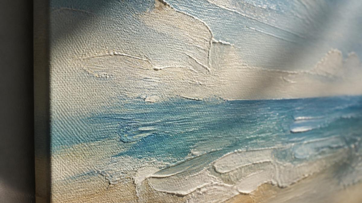
What to Look for in Product Images
Zoom in on product photos. Look for visible brushstrokes, layered paint and surface variation; if the image looks completely smooth and flat, the texture is minimal. You want actual depth, shadows within the paint itself, not a flat illustration.
Check multiple angles if available. A good listing shows the artwork front-on and at an angle so you can see how light catches the texture, texture is meaningless if you can't see it.
Read the material specifications. Heavier canvas (measured in ounces per square yard) means more texture potential. The Wave Textured Painting Canvas Print from Pure Art Moments uses a 10.15 oz/yd² poly-cotton blend, delivering genuine tactile depth rather than a printed illusion.

Texture Care in Humid and Salty Coastal Environments
Coastal air is harsh: salt spray and humidity can damage artwork. Textured pieces need different care than flat prints.
Canvas with a poly-cotton blend resists humidity better than pure cotton, the synthetic component sheds moisture rather than absorbing it. This matters near the ocean or in a humid climate.
Avoid raw wood frames in coastal environments; moisture warps them. Look for sealed or treated wood, or metal frames.
Dust your textured pieces monthly with a soft brush. Texture traps dust more easily than flat surfaces. A gentle brush removes particles without pushing them deeper into the weave.
Step 3: Choose Artwork Size and Scale for Your Wall
Size matters more than most people realise. A piece that looks perfect in a showroom can overwhelm a bedroom or disappear in a living room.
Measure your wall space first and mark the dimensions with painter's tape to visualise the actual size.
For a focal point above a sofa or bed, aim for artwork that's roughly two-thirds the width of the furniture.
In smaller spaces like bedrooms or hallways, smaller pieces work better: a 60-centimetre canvas feels substantial without cramping the room. The Wave Textured Painting Canvas Print comes in 13 sizes, from 20 centimetres up to 94 centimetres, so you can match your exact space.

Leave breathing room around your artwork. At least 15 centimetres of clear space on either side helps the piece stand out rather than blend in.
Step 4: Match Artwork to Coastal Interior Design Trends
Trend lists are the least useful part of most coastal art guides, because trends move faster than the artwork on your wall. What actually determines whether a textured piece looks considered or chaotic is sensory balance, a framework you can apply to any style, current or not.
Why texture needs a counterweight
A textured surface is a sensory event. Raised plaster, heavy brushwork, woven linen and raw timber all demand attention because they break the flat plane of a wall.
The practical rule is one dominant texture per sightline. Stand where you most often view the wall. Count the strongly textured surfaces in that view: the artwork, a rattan chair, a chunky knit throw, a rough stone side table. If the count is above three, remove or soften one before you add art.
Pairing textures that work together
Some combinations reinforce each other; others compete. Reliable pairings:
Wave Textured Painting Canvas Print | Gallery-Quality Coastal Wall Art | 13 →
- Raised plaster or impasto brushwork with smooth linen. The contrast is the point. The smooth textile lets the relief cast clean shadows.
- Woven fibre or macramé with matte canvas. Both are tactile but at different scales, so they read as a family rather than a clash.
- Raw timber with soft, low-relief canvas. The timber supplies the roughness; the canvas supplies the calm.
- Glazed ceramic or glass with any texture. A small smooth, reflective object near a textured piece gives the eye somewhere to rest.
Pairings that tend to fight:
- Two heavily textured artworks of similar scale side by side.
- High-gloss finishes directly beside deep relief, because the reflections compete with the shadows.
- Busy patterned textiles (large-scale florals, geometric prints) under a heavily textured piece.
The 'one statement, one support' arrangement
For more than one piece on a wall, use a hierarchy rather than a grid of equals: one large textured statement piece plus one or two smaller, smoother supports. Keep the supports in the same palette at lower texture intensity, the layered look current coastal interiors favour, without the visual noise.
Style directions that age well
Rather than naming trends, describe the mood you want and let that drive the choice:
- Calm and airy: low-relief canvas, desaturated palette, generous wall space around the piece.
- Grounded and natural: visible weave or fibre, warm neutrals, timber and stone nearby.
- Quietly dramatic: deep relief with strong directional lighting, a darker dominant tone, minimal surrounding décor.
- Collected and personal: a mix of scales and formats, unified by palette and by a consistent frame or edge treatment.
Sustainability and provenance
Buying work by a named artist, or produced in small runs rather than mass-printed, is both ethical and practical. Ask where the work was made, who made it, and the edition size.
Step 5: Select Between Canvas, Prints, and Framed Art
Each format has distinct advantages; your choice depends on space, budget, and how permanent the installation should be.
Canvas prints deliver the most gallery-like appearance. The Wave Textured Painting Canvas Print offers this effect with fade-resistant ink and mounting brackets included.

Luster photo paper prints balance vibrancy with sophistication.
Canvas costs more upfront but lasts longer without fading. Prints are more affordable and easier to swap out.
Consider your wall type too. Canvas is heavier and needs sturdy anchors; framed prints distribute weight differently.
Step 6: Styling Textured Canvas Art in Your Room
Where you place your artwork matters as much as what you choose. Placement determines how the piece functions in your space.
Living rooms benefit from larger statement pieces above sofas or on feature walls.
Bedrooms call for calming artwork positioned where you'll see it as you wake.
Hallways and entryways need smaller, impactful pieces.
Home offices work well with artwork that inspires without distracting. Abstract coastal pieces with calm colours support focus better than literal imagery.
Light direction matters. Hang textured artwork where natural light or lamps highlight the surface; morning light from an east-facing window creates beautiful shadows across canvas texture.
Creating a Focal Point and Balancing Your Decor
A focal point gives a room visual purpose. Textured coastal wall art naturally becomes one because light and shadow draw the eye to it constantly.
Balance the focal point with the rest of your décor.
Complementary colours create harmony.
Avoid visual clutter near your artwork. Empty shelves, minimal wall space and uncluttered surfaces let the piece shine, whether you're hanging one statement piece or a small gallery wall.
The Colourful Flowers Textured Painting Canvas Print from Pure Art Moments works beautifully as a focal point in living spaces.
Choosing textured coastal wall art is about understanding what makes a piece work in your specific space.
Pure Art Moments offers gallery-quality textured coastal artwork that's been meticulously reproduced to preserve the depth and character of original hand-painted work. Whether you choose canvas, luster photo paper, or framed prints, each piece is designed to inspire your everyday life. Explore the complete collection of textured coastal wall art and find the piece that speaks to your space.
Frequently Asked Questions
What defines textured coastal wall art?
Textured coastal wall art combines tactile finishes with ocean-inspired imagery, think brushstroke detail, layered surfaces, and materials that catch light. Unlike flat prints, textured pieces preserve the depth and dimension of hand-painted originals. Canvas prints with poly-cotton blends and substantial weight (like 10.15 oz/yd²) deliver that gallery-quality feel, while luster photo paper adds subtle dimension through its partly glossy, partly matte finish. The texture makes the piece feel handcrafted rather than mass-produced.
How do I know if textured coastal wall art will work in a small room?
Smaller, scaled-down pieces work brilliantly in compact spaces. Canvas prints and luster photo paper posters come in multiple sizes, from 8×8" up to 37×37" for canvas, and 10×10" to 24×24" for prints. Start with a size that occupies roughly one-third of your wall space to avoid overwhelming the room. A single statement piece or a small gallery arrangement of coordinated prints creates visual interest without crowding. Lighter coastal colours (whites, soft greys, seafoam) also make small rooms feel more open.
How does lighting affect textured coastal wall art?
Lighting dramatically changes how texture appears. Natural light from windows highlights brushstrokes and surface detail, bringing out depth and dimension. Artificial lighting, especially warm or cool-toned bulbs, shifts the perceived colour and can either enhance or flatten texture. Directional light (like spotlights) casts subtle shadows across the textured surface, amplifying the tactile effect. For the best results, position your art where it receives consistent light during the day, and consider adjustable lighting for evening viewing.
What materials are best for coastal-themed textured art in humid environments?
Canvas prints on solid wood stretcher bars with fade-resistant, gallery-quality finishes hold up well in coastal humidity and salt air. Poly-cotton blend canvas (around 344 g/m²) resists warping better than pure cotton. Luster photo paper from Japan offers durability with its 10 mil thickness and fingerprint-resistant surface. Avoid materials prone to moisture absorption or corrosion. Store or display art away from direct salt spray and high humidity zones (like bathrooms immediately adjacent to showers). Regular gentle dusting keeps texture visible and prevents salt accumulation.