
Table of Contents
- Tip 1: Match the Frame Style to the Artwork and the Room
- Tip 2: Choose the Best Frame for Art Prints by Material and Width
- Tip 3: Use Fine Art Print Matting to Create Negative Space
- Tip 4: Frame Art Prints With White Borders and Float Mounts
- Tip 5: Choose UV-Protective Glass for Art and Archival Materials
- Budget and Custom Framing Cost Trade-Offs
- Frequently Asked Questions
Last Updated: October 18, 2026
Tip 1: Match the Frame Style to the Artwork and the Room
The best of our framing tips for a fine art print is to serve the artwork first and the room second. A frame should feel like a natural extension of the piece, not a competing statement. At Pure Art Moments, we see the same pattern again and again: people choose a frame they love in isolation, then wonder why the print looks lost on the wall. The frame and the art have to agree before the room gets a vote.
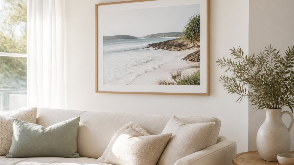
Reading the artwork's visual weight and colour palette
Visual weight is how much attention a piece demands. A dense, high-contrast print carries more weight than a soft, pale watercolour. Heavy artwork can hold a wider, darker frame. Delicate work gets swallowed by one.
Colour works the same way. A warm sunset piece such as our Point Lonsdale Rock Pools Sunset Fine Art Print suits natural timber, white, or black, and pairs beautifully with linen and neutral tones.

Coordinating with existing decor without overpowering the print
Walk into the room and look at what is already there. Timber furniture, brass hardware, and woven textures point toward wood. Chrome, glass, and sharp lines point toward metal. A coastal interior with rattan and pale fabrics rarely wants a heavy ornate frame.
The mistake we see most is choosing a frame that matches the sofa rather than the art. That is how prints end up looking like an afterthought. The frame's job is to accentuate and highlight, never to overpower.
Tip 2: Choose the Best Frame for Art Prints by Material and Width
The best frame for art prints balances material against width, and most people get the width wrong. Material sets the mood; width sets the scale. Get both right and the print looks gallery-hung. Get width wrong and even an expensive frame looks cheap.
Wooden frames versus metal profiles, and getting the proportions right
A wooden frame brings warmth and texture. It suits painterly, organic, and coastal work, which is why our Garden Art Print and The Stump Gembrook Fine Art Print both read best in natural timber. Metal profiles are cooler and more architectural.

Width should scale with the print. A small 5x7 inch print looks fussy in a wide moulding; a large 24x36 inch statement piece looks underdressed in a thin one.
| Print size | Suggested frame width | Frame style that works |
|---|---|---|
| 5x7 to A4 | 1.5 to 2 cm | Slim timber or thin metal |
| A3 to A2 | 2 to 3 cm | Mid-width timber, clean profile |
| A1 to 24x36 | 3 to 4 cm | Wider timber or bold black metal |
Tip 3: Use Fine Art Print Matting to Create Negative Space
Fine art print matting is the border of board between the print and the frame, and it does more for a piece than most people realise. A mat creates negative space, lifts the artwork off the glass, and gives the eye somewhere to rest. It also protects the print from pressing against the glazing, which matters for anything you intend to keep for years.
Mat width and sizing with worked examples
Mat width should grow with the print. Too narrow and the mat looks like an accident; too wide and the artwork shrinks. A reliable working rule is that the mat border on each side should sit between roughly one-eighth and one-quarter of the print's shortest dimension.
Worked examples using standard sizing, with all measurements in centimetres and inches where helpful:
- 5x7 inch print in an 8x10 inch frame. The frame opening is 20.3 x 25.4 cm and the print is 12.7 x 17.8 cm, leaving a mat border of roughly 3.8 cm on each side. That is a classic gallery look for a small piece and sits comfortably inside the one-eighth to one-quarter rule.
- A4 print in an A3 frame. A4 is 21.0 x 29.7 cm and A3 is 29.7 x 42.0 cm, giving about 4.35 cm of border on the short sides and 6.15 cm on the long sides if the mat is cut evenly. For a hallway or shelf display, trim the mat to an even 4 cm border so the print does not look bottom-heavy.
- A3 print in an A2 frame. A3 is 29.7 x 42.0 cm and A2 is 42.0 x 59.4 cm, so an even mat border works out at about 6.15 cm on the short sides and 8.7 cm on the long sides. That is a generous gallery border and suits a larger wall.
- 24x36 inch print with a 5 cm mat. The print is 61.0 x 91.4 cm, so the frame needs to be roughly 71 x 101 cm to hold a 5 cm border all round. That is a statement piece and should be planned for a specific wall rather than bought on impulse.
A common pattern is to make the bottom border slightly deeper than the top and sides, often by 0.5 to 1 cm, so the print appears optically centred rather than mathematically centred. This is a standard framing convention and costs nothing extra to specify.
Accounting for borders, signatures and deckle edges
If the print has a white border printed into the paper, decide whether the mat should overlap it or sit outside it.
For a deckle edge, a mat that overlaps the edge will crush the deckle and defeat the point of showing it.
For a smaller print, a mat border adds a classic gallery-style finish without changing the artwork itself. Our Bird Art Print and Pelican on the Lake Art Print both suit a mat at their smaller sizes.
Tip 4: Frame Art Prints With White Borders and Float Mounts
Framing art prints with white borders lets the paper edge show, and that changes how the piece reads. A white border is the margin built into the print itself.
Float mounts suit prints with a deckle edge or a visible signature, because they display the edge rather than cropping it.
Traditional matting covers the paper edge. A float mount reveals it. If the print has a signature or a deckle edge worth showing, float it. If the image is the whole point, mat it.
Point Lonsdale Rock Pools Sunset Fine Art Print | Coastal Wall Art | 16 Sizes →
Tip 5: Choose UV-Protective Glass for Art and Archival Materials
UV-protective glass for art blocks the ultraviolet light that fades pigments, and it is the cheapest insurance you can add to a print. All of our prints are made on archival-quality matte paper with Giclée printing, but archival paper only protects the print if the glazing and backing do their job too. This is the part of framing most guides skip, and it is where a print either survives a decade in good condition or quietly fades.
Glazing choices and reflection management
Glazing is the glass or acrylic sheet in front of the artwork. The practical choices are:
- Standard glass. Clear and inexpensive, but offers limited UV protection and shows reflections. Suitable for a print in a low-light room where appearance matters more than longevity.
- UV-filtering glass. Blocks most UV light while staying clear. The sensible default for anything you care about, and the option to specify when a print will hang near a window or in a bright room.
- Anti-reflective glass or acrylic. Cuts glare in bright rooms, which matters for a print hung opposite a window or under a downlight. It costs more than standard glass and is worth it where reflections would otherwise wash out the image.
- Acrylic glazing. Lighter and safer than glass for large pieces and for homes with children, because it resists shattering. It scratches more easily than glass, so clean it with a soft cloth and avoid abrasive cleaners.
Glass is more scratch-resistant than acrylic but heavier and more fragile. For a large 24x36 inch piece, the weight difference is significant and affects both the hanging hardware and the wall fixing. For a small A4 or 5x7 inch print, standard glass is usually fine.
Archival backing and reversible mounting
Glazing is only half the conservation story. Ask for acid-free backing board rather than standard cardboard, which can off-gas and stain the print over time. Specify archival mounting, hinging with acid-free tape or corners rather than dry mounting, so the print can be removed later without damage.
Hang the print away from direct sunlight and away from heat sources such as radiators. Our Cinque Terre Italy Art Print listing makes the same point: display away from direct sunlight to preserve colours long-term.

Australian Government guidance on caring for art and heritage collections
Budget and Custom Framing Cost Trade-Offs
Custom framing costs more than ready-made, and the gap is widest on small prints.
Our prints start at $43.00 for a poster, supplied unframed. That price gives you the artwork; the frame is a separate decision.
Two things to weigh:
- Standard sizes such as A2, A3, and A4 are widely available ready-made, so you save on the frame.
- Non-standard sizes and float mounts almost always need custom work, so factor that into the print you choose.
The trade-off is not about quality. It is about how much precision the piece needs.
Art Gallery of New South Wales conservation advice on framing works on paper
Framing a fine art print well comes down to a series of small, deliberate framing tips: the frame style, the width, the mat, the mount, and the glazing.
Frequently Asked Questions
How do you choose a frame for a fine art print?
Start with the artwork's visual weight and colour palette, then match the frame style to the room it will hang in. A warm coastal print like the Point Lonsdale Rock Pools Sunset Fine Art Print ($43.00) suits natural timber, white or black frames. Keep the frame width in proportion to the print size: slim profiles for small prints, wider profiles for statement pieces. The frame should support the artwork, never overpower it.
Should fine art prints be framed with a mat?
A mat is optional but useful. Fine art print matting creates negative space between the artwork and the frame, which draws the eye inward and gives the print room to breathe. If your print already has a white border, you can skip the mat or use a narrow one to keep the border visible.
What type of glass is best for framing art prints?
UV-protective glass for art is the safest choice. Standard glass and acrylic let ultraviolet light through, which fades pigments over time. UV-filtering glazing blocks most of that damage, and acrylic glazing is lighter and safer for large frames. Whichever you choose, hang the print away from direct sunlight, since no glazing stops fading entirely.
Should a print's white border be left visible when framing?
Yes, if the border is part of the print's design. Framing art prints with white borders visible keeps the composition intact and gives a clean, gallery-style finish. Float mounting is the usual method: the print sits on top of the backing board rather than under a mat, so the full sheet and its deckle edge show. Leave a small gap between the print edge and the frame so the paper can expand and contract.
How much space should there be between a print and its frame?
If you are using a mat, the mat itself provides spacing. For float mounts, a reveal around the print looks deliberate rather than cramped.